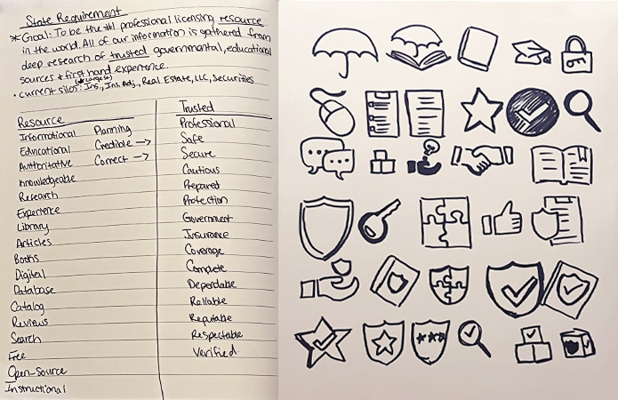
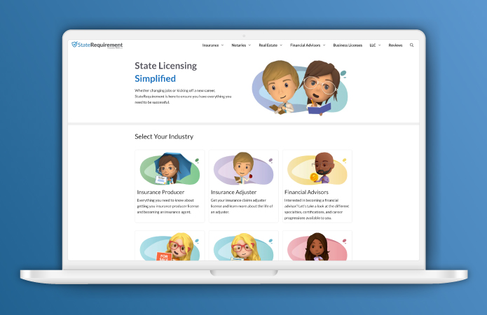
The stakeholders wanted the brand personality to communicate a sense of competence and dependability. The goal of the website was (and still is) to be the #1 professional licensing resource in the world. I used this information to create a list of associated words. This helped me to come up with logo marks while sketching. For the color palette I chose a couple of different blues to symbolize trust and authority. These were similar to the colors used in the past, but I made them more accessible.
Duration: 2 days (August 2021)
Role: Designer
Challenge: Logos have to be visible at a very small size. In this instance, we wanted a logo that would also translate into a good favicon.
Solution: I kept the logo very simple. For the favicon I used a portion of the logo instead of the whole thing. The checkmark in the logo is used to represent credibility.
My Process
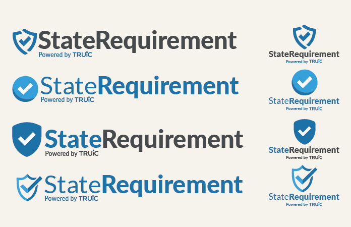
I started this project by writing down the goal of the company. From that I selected two words to use to create word association lists. This helped me to generate ideas during the sketching process. I created logo comps from some of my sketches. Stakeholders provided feedback that allowed me to refine the comps. Then we chose a logo from those comps.
